
My Role
Product Designer
I was the sole designer on this project from R&D prototype through launch. I worked directly with the engineering team to scope what was technically possible and shaped the product direction from there.
- Research: Drove the research strategy and ran user testing sessions to validate the experience at every stage.
- UX Design: Owned the full user experience, including information architecture, interaction design, and UX copywriting.
- Visual Design: Expanded the Warby Parker design system with new components and defined the art direction for the illustration system.
- Animation: Created all animated assets myself as Lottie files for the app.
I leaned on a five-person product design team for feedback and context on Warby Parker's customer base. Day to day, I partnered with a PM, a pair of iOS engineers, and the R&D team that built the AI-powered distance tracking system at the heart of the app.
01 The Problem
Warby Parker customers frequently tried to buy glasses or contacts and couldn't because their prescriptions were expired. Getting a new prescription meant visiting an eye doctor. At the height of the COVID-19 pandemic, that wasn't just inconvenient and expensive. It was dangerous.
There was also a bigger business problem. Warby Parker was launching an in-house contacts brand, but doctors have favorites and contacts prescriptions are often brand-specific. Without a way to get more Warby contacts prescriptions into the world, there was no real path into the contacts market.
If we could verify distance, we could build an FDA-certified remote eye test. No one had done this.
The R&D team had prototyped computer vision tech that could measure how far a person was from their phone using the iPhone camera and ML. The medical definition of an eye test is "read a chart from 10 feet away." If we could reliably detect that distance, we had a path to FDA certification and a real competitive advantage.
I was the first designer on this project. The R&D engineers had rough technical prototypes. I was given the assignment: "We think we can build a vision test." My job was to figure out if that was true and turn it into a real product.
02 Evaluating the Technology
Before any design work began, I tested every prototype the R&D team had built. There were several approaches to distance detection. I evaluated each one for usability and targeted the one that used facial recognition as the most user-friendly option. This became the foundation we built the product on.
Because we had this technology, we could beat other players in the market and pursue FDA certification. That was the strategic advantage.
03 Mapping the Customer Flow
I worked with my PM to map out the complete user experience:
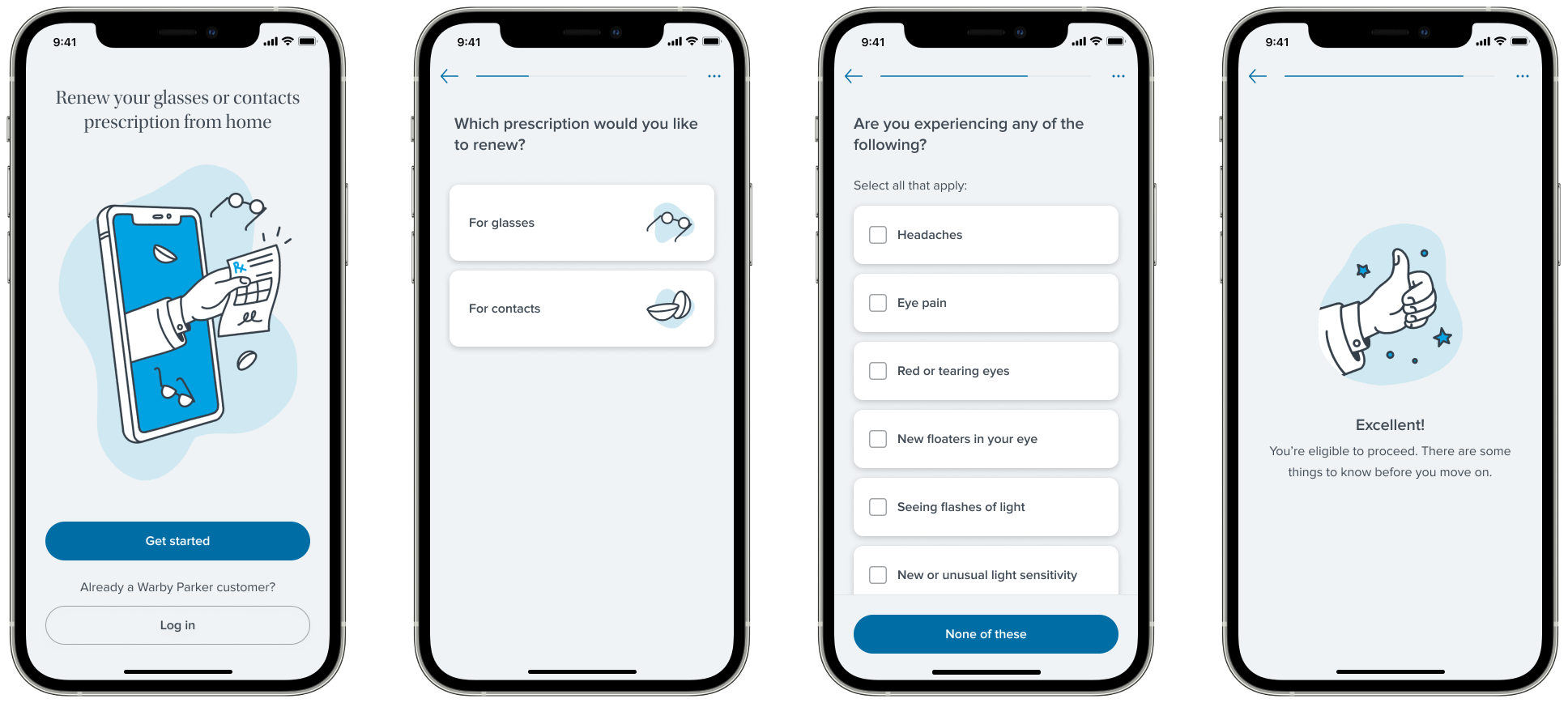
- Eligibility Survey: Triage customers based on prescription type, state telehealth regulations, and preexisting conditions. Identify who qualifies for a remote prescription and route everyone else to an in-store visit.
- Vision Test: Read the eye chart from 10 feet away while the phone tracks distance via ML.
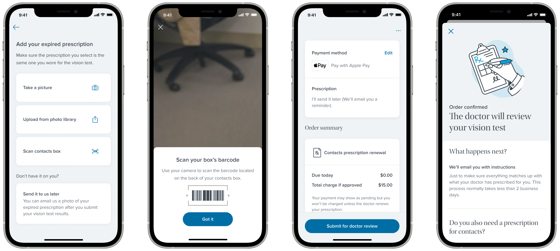
- Prescription Info: Enter your RX values or upload a photo/file of your current prescription.
- Payment: Collect payment, communicate prescription status, handle graceful rejection and referral to in-store visits.
A team of remote eye doctors would then review audio recordings of each test and verify the results.
Our targets: ~50% eligibility rate (typical based on our in-store demographic data), and a high conversion rate from prescription to purchase. For each phase, I identified specific goals and solved them independently.
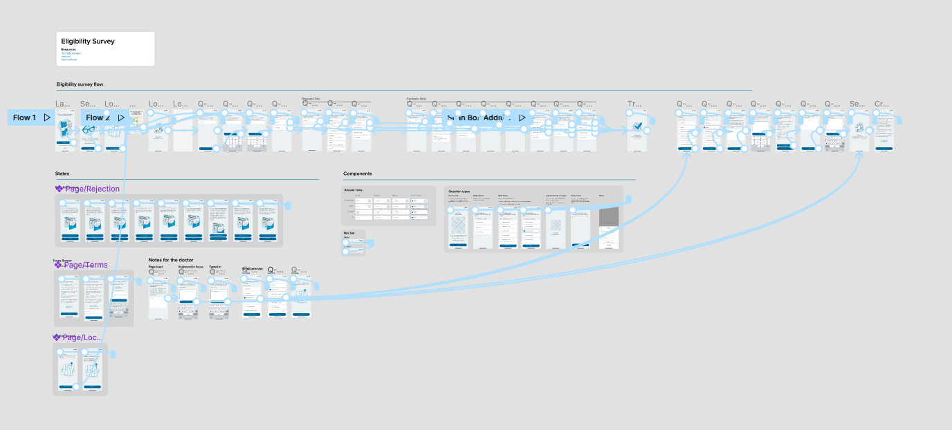
04 Eligibility Survey
Why This Mattered
Only a subset of customers could actually use the app. Eye doctors would only write remote prescriptions for single-vision distance corrections, not progressives or other complex lens types. Telehealth regulations varied by state, so we needed to know where someone was located. And any preexisting conditions that could affect vision (glaucoma, diabetes, recent eye surgery) required an in-person visit. The eligibility survey was a triage system: figure out who can get a remote prescription and who needs to come into a store, as efficiently as possible before people get confused or bored and bounce.
Testing Three Interaction Paradigms
I designed three different experience models to test with users:
- Quiz format: One question at a time, forward and back navigation. Most efficient. If someone got an answer wrong they could easily hit the back button and fix it.
- Chatbot: Scripted responses, not actually intelligent. Made the whole conversation feel annoyingly slow. Users wanted to go back and change answers, which was nearly impossible in a chat interface.
- Single-page form: All questions on one screen. Not flexible enough to support the branching logic we needed.
We ran user testing calls with potential customers. The quiz format performed the best by a wide margin.
05 Prototype Demos
The chatbot prototype. Initially promising, but too slow and hard to navigate backwards.
The quiz prototype. Faster, easier to navigate, and the clear winner in testing.
06 Refining the Quiz Script
With the quiz format locked in, I led the effort to optimize the language of each question. The most critical one was "what kind of prescription do you have?", the single question that determined whether someone could use the product at all. I worked closely with our UX research team, iterating on copy and validating each revision against real user testing data.
My first strategy was to try diagnosing people with simplified, subjective questions: "Can you read small text?" "Do you wear glasses for driving?" Research showed this was a dead end. The questions were too subjective and people gave wildly inaccurate answers.
Clarity matters more than ease.
I shifted the approach to listing prescription types with detailed, clinical descriptions: "Single vision distance: you wear glasses or contacts primarily to see things far away, like driving or watching TV." The research data backed it up. It was harder for people to parse, but it dramatically increased the accuracy of their answers. When the answer determines whether someone can use the product, getting it right matters more than making it easy.
07 Building for Scale
I standardized question types, input patterns, and transition animations so engineering could get a head start on implementation while we were still refining copy. I also added a progress bar to signal the quiz was short and easy, which helped reduce abandonment. These components were added to the Warby Parker design system and reused in other products, including the checkout redesign.
08 Eligibility Results
We went through multiple rounds of user testing to get the eligibility survey right. Each round surfaced new issues with question clarity, ordering, and branching logic. We iterated on the copy, refined the interaction patterns, and retested until the experience felt effortless. By the time we launched, the survey had been tested and revised more than any other part of the product.
Right on target with our in-store demographic data. The survey was accurately identifying distance-prescription customers and filtering out everyone else.
Four out of five eligible customers went on to complete a purchase. The funnel was doing its job: qualifying the right people and keeping them engaged through checkout.
Achieving the goals
The survey accomplished what we set out to do. Customers with distance prescriptions in eligible states moved through quickly and converted at a high rate. Just as importantly, customers who weren't eligible were routed gracefully. We directed them to book in-store appointments rather than dead-ending their experience. The triage system worked: the right people got remote prescriptions, and everyone else still had a clear path forward.
09 Visual Direction
The Warby Parker ecommerce site relies heavily on model photography to set its tone, but for a telemedicine product, photos of people looking at a phone just weren't compelling. I needed to find a visual language that worked for a medical app.
The goal: make it feel like Warby Parker, not like a doctor's office.
I explored several directions: illustration styles, photography approaches, and color palettes, weighing customer expectations, Warby's brand personality, and consistency with their other products.
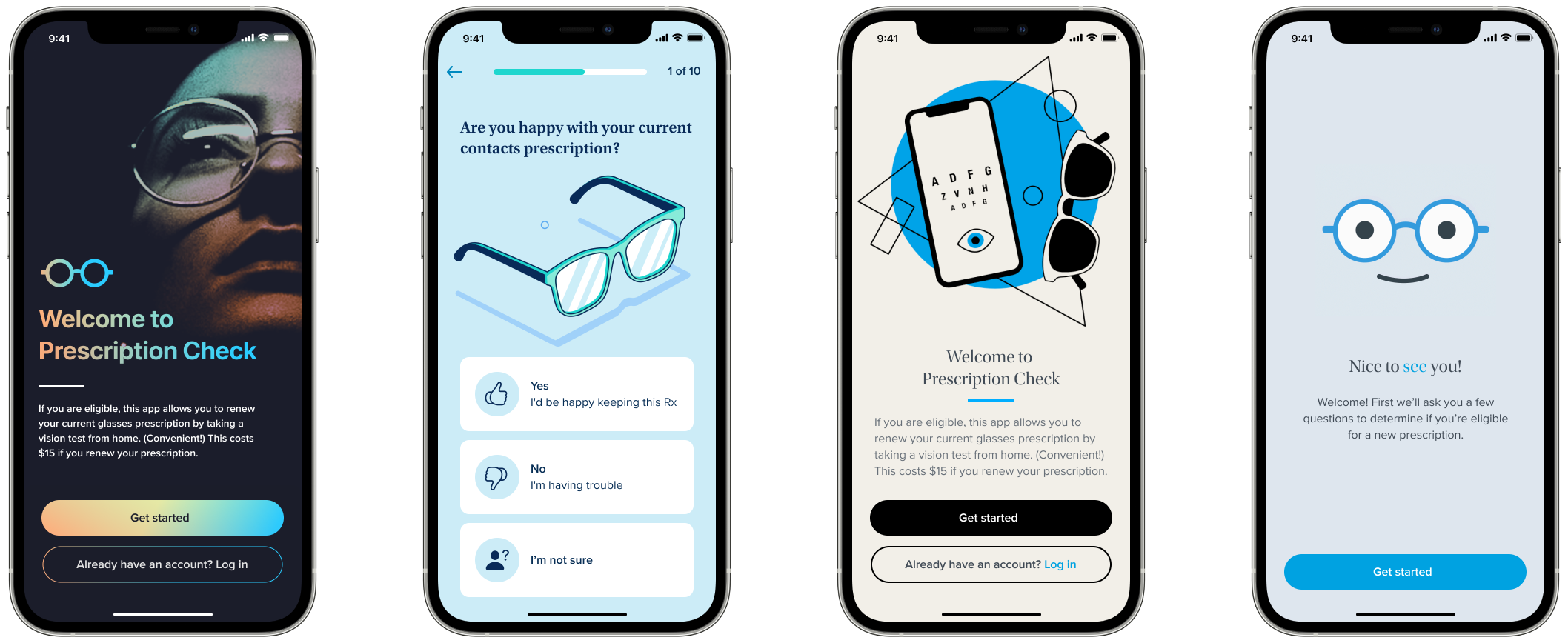
The Direction
We settled on illustration. I defined the creative direction, then partnered with the Brand team to produce the final assets. I animated everything myself as Lottie files for the app.
Moments of Delight
I added animated illustrations between survey questions and at key transitions throughout the app. Small touches that kept the experience feeling fun and on-brand rather than clinical.
10 Vision Test
This was the critical piece. If we got this wrong, the entire product would flop.
The Core UX Challenge
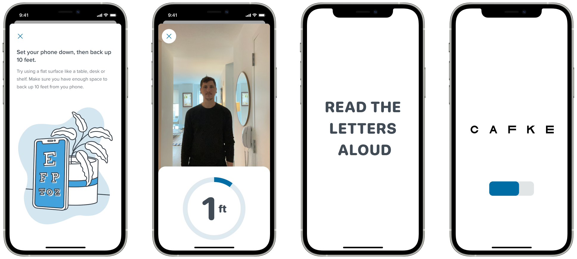
We were asking users to do something no app had ever asked them to do: prop up their phone against something stable, walk 10 feet away, and read an eye chart. Because they're standing across the room from their phone, normal interactions like tapping a button aren't an option. There were serious concerns that users would just get stuck.
High-Fidelity Prototyping
I built the entire vision test and distance detection experiences as fully interactive prototypes in ProtoPie. This was a critical decision. The timing of audio cues, sound effects, animations, and micro-interactions all had to be precisely tuned to evaluate whether the experience would work. You can't judge that in static mocks or even a Figma prototype. It had to feel real.
These weren't throwaway wireframes. They were functional enough that we could test them with real customers over video calls, with the help of our research team. We validated the entire product experience before a single line of production code was written.
11 Testing with Real People
We tested these prototypes with real customers over video calls, with the help of our research team. We directed participants to measure the 10-foot distance with a tape measure so we could validate the experience against a known distance. There were two distinct phases of testing, each aimed at solving a different problem.
Phase 1: The Vision Test
The challenge here was directing someone who is standing 10 feet away from their phone. We had to tell them what to do using only on-screen visuals and audio. No tapping, no swiping.
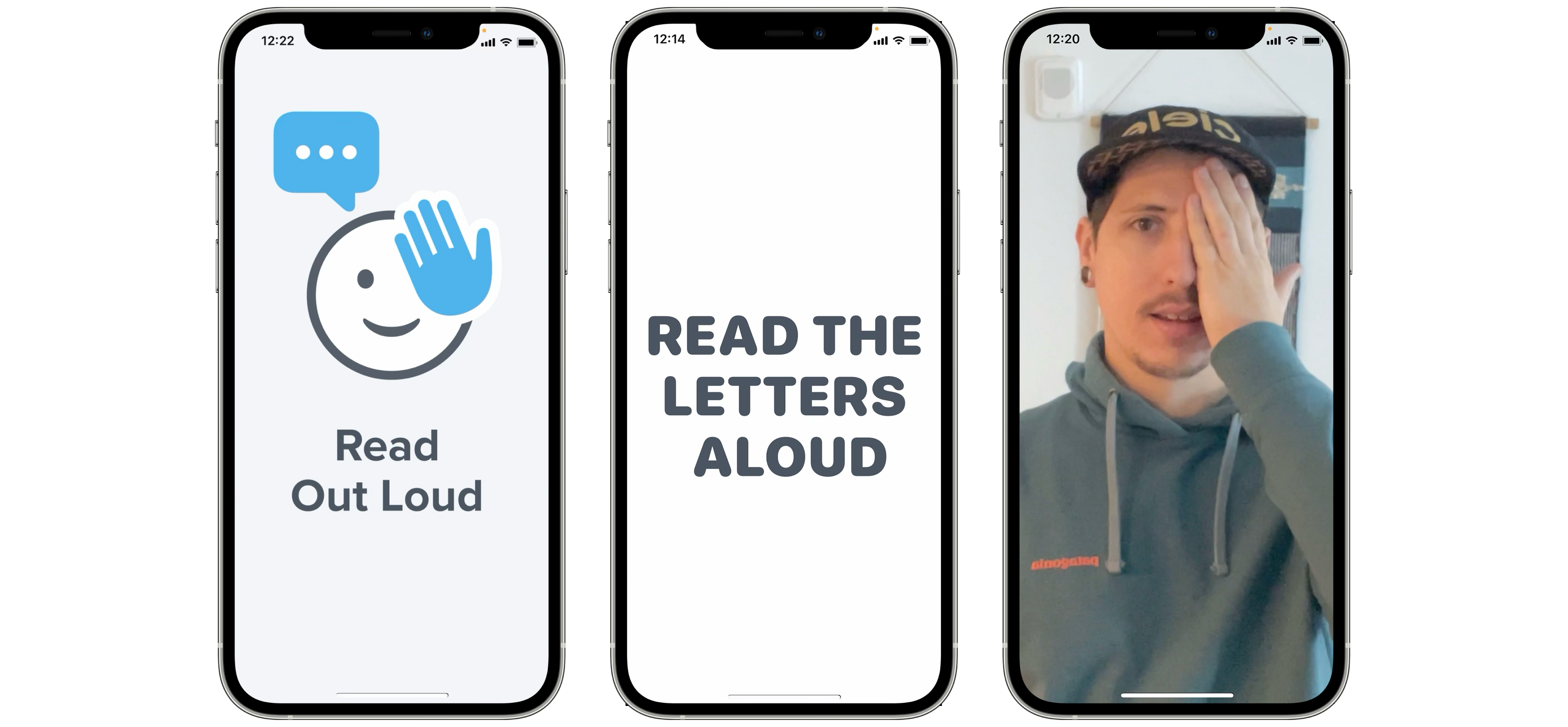
A key finding: we needed users to cover their right or left eye, and our initial instinct was to show illustrations demonstrating which eye to cover. This actually caused more confusion because people couldn't tell if the illustration was mirrored. Were they looking at the figure from behind, or facing it? Removing the illustrations and relying on clear text and audio instructions performed significantly better.
Phase 2: Distance Detection
The other major challenge was getting users to walk backwards 10 feet away from their phone and telling them when they were in position. We tested several concepts for how to communicate distance.
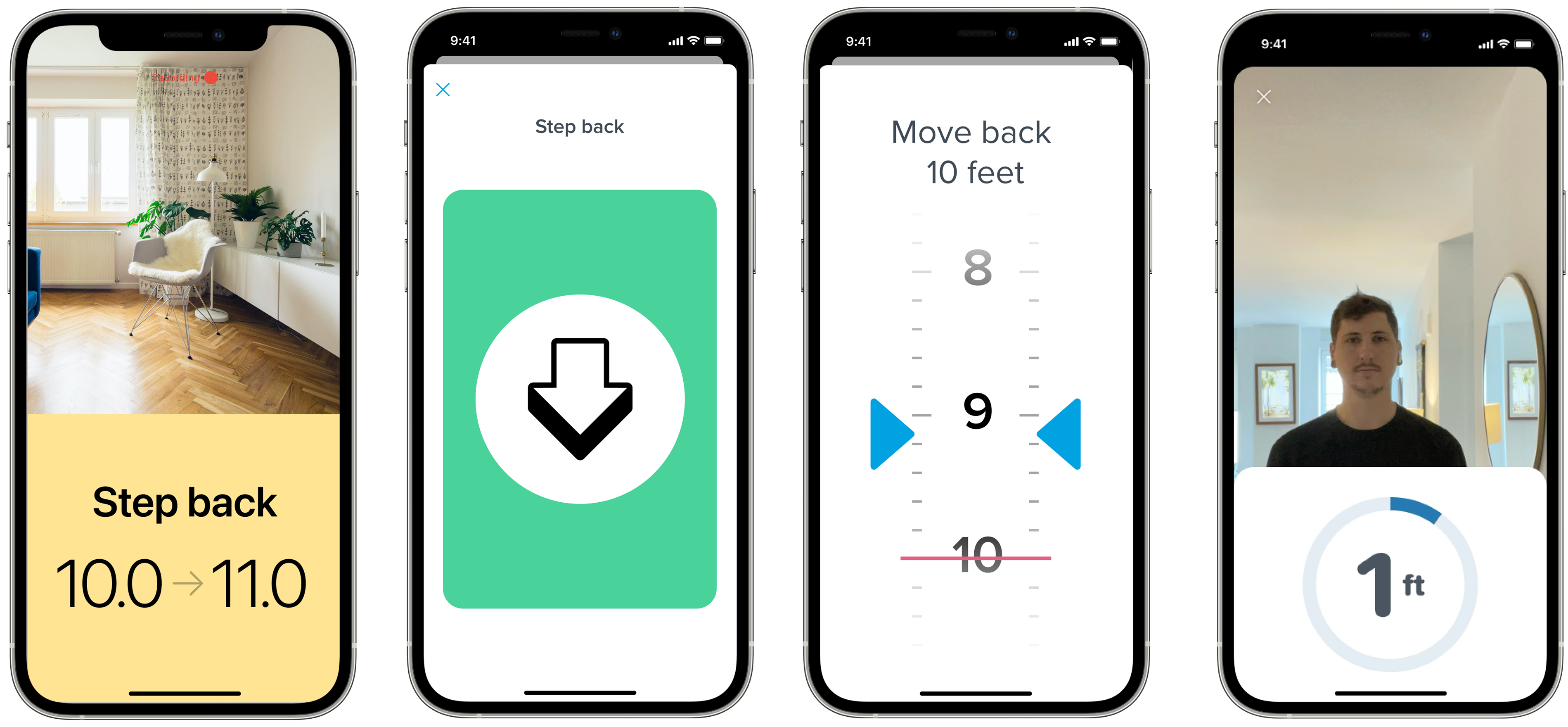
Ideas that seemed intuitive on paper, like a skeuomorphic tape measure or color-coded stop/go indicators, actually caused more confusion than they helped. The winning approach was showing a live camera preview so users could back up without having to turn around to see what was behind them. Simple and practical beat clever and visual.
Results
The results were encouraging: we were close to an 80% pass rate, not far off from an in-person vision test. This let us lock in our direction and answered a lot of open questions about whether the concept could work at all. We validated the entire product experience before a single line of production code was written.
Less instruction was more effective.
It was tempting to start with a bunch of instructions and explanations. But when we tested this with users, we found that the instructions were more confusing than useful. Telling someone to find a well-lit room could cause them to waste minutes looking for one before they even start. The best approach was to let people dive into the experience and provide troubleshooting tips only if they encountered problems.
12 Implementation
During implementation, I partnered closely with the engineering team. We made adjustments to reflect the actual underlying technology as it matured. Then we hit snags.
The Vision Test Wasn't Reliable
The distance detection step often lost track of people and gave inaccurate readings. The whole experience would break. This was the moment where the project could have stalled.
The Design Sprint
We got everyone together in person for a 3-day intensive design sprint:
- 2 iOS Engineers
- 2 Product Managers
- 2 UX Researchers
- 20+ Research Participants
- 1 Eye Doctor
- 1 Designer (me)
We ironed out many UX details that were impossible to catch remotely. For example: we had a "continue" button that users would tap after setting their phone down and stepping back. The problem was that reaching for the button often knocked the phone over. We solved this by removing the button entirely and starting the vision test when the accelerometer detected the phone was stationary. A small detail, but it eliminated a major failure point.
13 The Accessibility Crisis
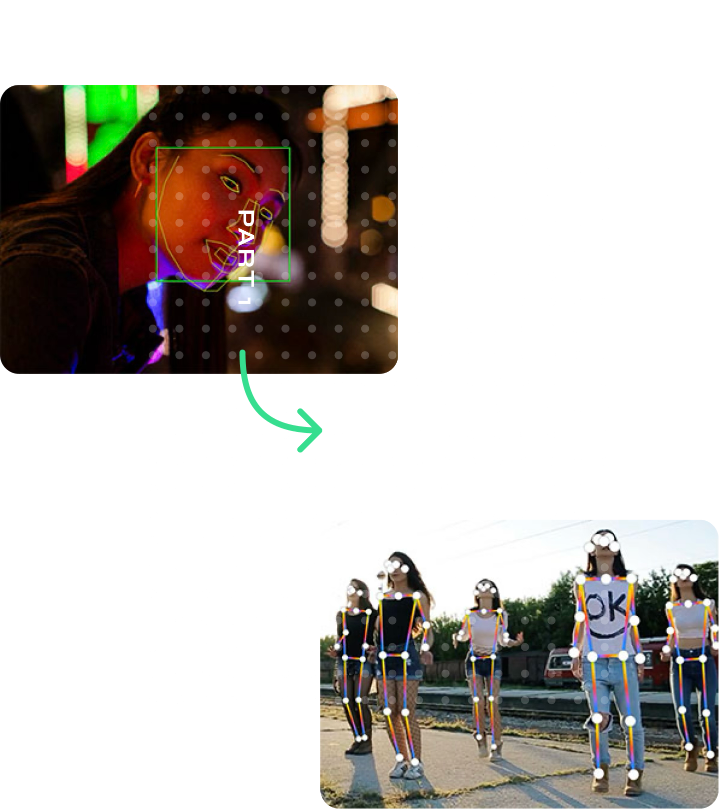
Then we found the real problem. We had assumed Apple's facial detection algorithm would work reliably for everyone. It didn't. The algorithm frequently lost track of people with dark skin and people with beards. This was the root cause of our reliability issues.
This was a major moment for the team. We had to go to leadership and tell them this was a risk that could jeopardize the entire project.
The Pivot
The R&D team proposed an alternative: switch from face tracking to body tracking, using shoulder width as the baseline to estimate distance. It was a fundamentally different technical approach, and it came with a real trade-off.
Face Tracking
More accurate at measuring distance, but inconsistent at detecting users. The bias in Apple's algorithm meant it frequently failed for people with dark skin and people with beards.
Body Tracking
Less accurate at measuring exact distance, but dramatically more reliable at detecting users. Worked consistently across all users regardless of skin tone or facial hair.
Trading accuracy for reliability
The team made a strategic decision: we would accept lower distance accuracy in exchange for the ability to reliably detect every user. But this created a new risk. Our entire FDA application depended on the accuracy of the distance measurement. We didn't know if the reduced precision of shoulder tracking would fall outside the margin of error required for FDA clearance.
We had to retest the entire experience from scratch and remeasure everything with the new tracking system. The data went into our FDA application. The numbers came back within the acceptable margin of error, and the project was back on track.
14 The Final Experience
After months of work, the final experience was something Warby Parker was genuinely proud of. The company featured it heavily in promotional materials and press coverage. The final deliverables included detailed engineering annotations, animated Lottie assets, sound effect files, and high-fidelity prototypes.
Most importantly, it achieved a core goal of the project: making it dramatically easier for customers to get prescriptions, which in turn drove contacts sales. Contacts prescriptions are brand-specific, so every prescription written through the app was a prescription only Warby Parker could fulfill. The experience was later expanded to include a contacts box scanning flow, further optimizing the path from prescription to purchase.
Brand team promo video for the Virtual Vision Test app.
15 Final Prototype
High-fidelity Figma prototype of the eligibility survey, used for final presentation and testing.
16 Results
One of the first remote vision testing apps to earn FDA certification
Best Use of AI/ML
Featured on the Apple App Store
Impact
In the months leading up to Warby Parker's IPO, the Virtual Vision Test became a major PR asset, positioning the company as a technology innovator rather than just an eyewear retailer. More importantly, it unlocked the contacts business. Contacts prescriptions are brand-specific, so customers could only get a Warby contacts prescription through Warby Parker. The Virtual Vision Test became the pipeline that made their in-house contacts brand viable.
17 Key Takeaways
Build the whole thing in prototype first.
The ProtoPie prototype let us test interactions that were impossible to evaluate in static mocks. Timing, audio cues, spatial interactions all had to be experienced to be evaluated.
Clarity beats simplicity.
Our instinct was to make eligibility questions easier. Research showed that harder, more precise questions produced better outcomes. When the answer determines if someone can use the product, accuracy matters more than ease.
Let people dive in.
Upfront instructions were more confusing than helpful. Troubleshoot when problems happen, not before.
Technology has bias.
Face tracking didn't work for everyone. We caught it, escalated it, and pivoted. If we hadn't tested with diverse participants, we might have shipped a broken product.
Get in a room together when the stakes are high.
Three days of in-person testing with engineers, researchers, participants, and a doctor compressed what would have been months of remote iteration.