
My Role
Senior Product Designer
I was responsible for assessing why the existing intake experience wasn't working, proposing a strategy to improve completion rates and reduce the bounce rate, and designing the A/B tests to validate that strategy. I partnered with a product manager and a couple of engineers on this project.
01 What is Zocdoc?
Zocdoc is an online marketplace where patients can find in-network doctors and book appointments. The platform connects patients, doctors, and insurance providers.
02 The Problem
Doctors didn't trust Zocdoc patients. Bookings made through the platform were seen as unreliable. Patients would book and then not show up. This was a real problem for Zocdoc's relationship with its provider network.
If a patient submitted their paperwork before the appointment, it was a strong signal they were actually going to show up. It also saved time during the visit and gave the doctor confidence that this was a serious patient.
The goal was to make Zocdoc patients the most desirable patients a doctor could get.
They show up prepared, with all their documentation and paperwork already done.
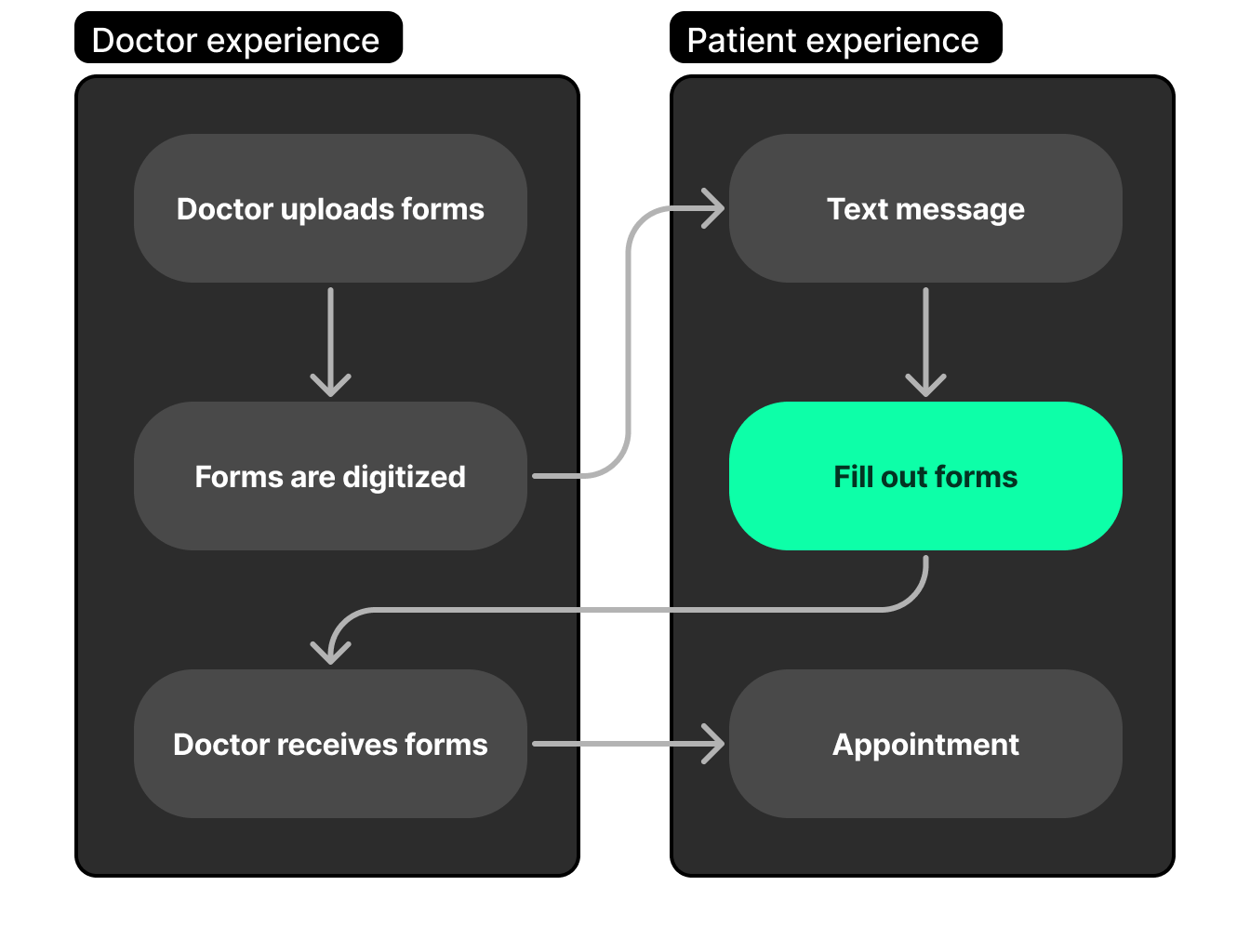
02b How Intake Works
Every doctor's office has its own paperwork: medical history forms, consent documents, insurance verification sheets. These are typically printed PDFs that patients fill out on clipboards in the waiting room.
Zocdoc's intake product turns those paper forms into nicely formatted, fillable web experiences that patients can complete on their phones before they even walk into the office. Doctors upload their PDFs, a Zocdoc operations team digitizes them into structured question sets, and the intake system presents those questions to patients as a clean, mobile-friendly flow.
03 The Challenge
Every doctor's paperwork is different. Different formats, different questions, different requirements. There was no standard.
Zocdoc had a team that would take disorganized doctor PDFs and transform them into an annotated list of questions. My job was to turn that list into a clean user flow with the correct inputs to handle any kind of form a doctor could want, and present it to patients in a mobile-friendly format.
One system that could handle every doctor's unique paperwork, while feeling simple and fast for patients.
04 What Already Existed
We weren't starting from zero. Zocdoc had launched a digital intake product in 2022, but it had serious problems.
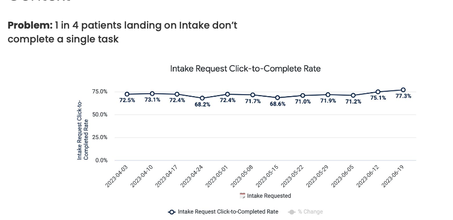
The numbers told the story:
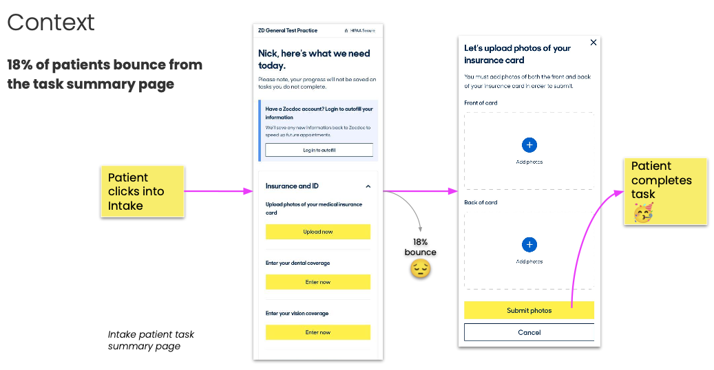
1 in 4 patients didn't complete a single task. We were well below our Q1 targets of 80% completion for Zocdoc patients and 53% for patient panel.
The existing design used a hub-and-spoke model. Each doctor's form was presented separately. When a patient completed one form, they were sent back to a home list to start the next one. If a doctor required three forms, the patient filled out their name and birthday three times.
There was also significant mid-funnel dropoff between when patients landed on the intake task page, clicked into individual tasks, and completed them. Part of the problem was requiring patients to self-select their patient type before even seeing their tasks.
That's not how patients think about paperwork. They want to fill it out once and be done.
05 The Redesign
First, I audited all the common pieces of information that doctors needed across their various PDFs. There was a lot of overlap: name, date of birth, insurance info, medications, allergies, medical history. The same questions appeared in different formats across different forms.
My approach: take all of a doctor's forms, distill them into a minimum number of questions, order them by importance, and turn the whole thing into a single user-friendly flow.
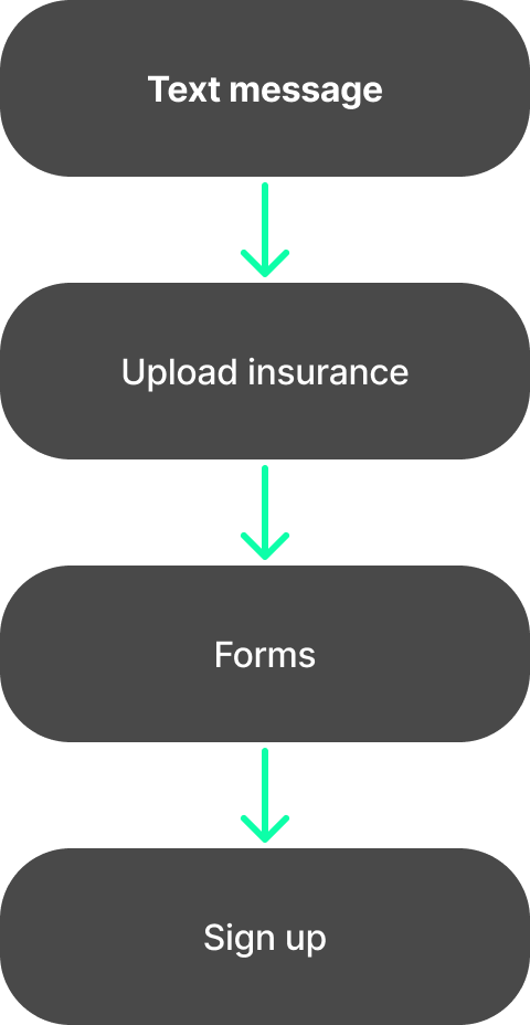
Instead of hub-and-spoke, patients would go through one combined form. No repeated questions. No bouncing back to a list. Just answer everything once, in order, and you're done.
Five concepts explored
I proposed five different approaches to improving intake completion:
- Improve the automated text message. The existing SMS was generic and easy to ignore. Make it more personal, more useful, and harder to dismiss.
- Encourage intake directly after booking. Instead of waiting to send a reminder later, push patients into intake while they're still in the booking flow.
- Launch an App Clip. Use Apple's App Clip technology to give patients a native experience without requiring an app download. We investigated this but it wasn't the right direction for this project.
- Chat to complete tasks. Let patients reply to the text message directly to complete their forms, bypassing the landing page entirely.
- Sequential flow. Replace the hub-and-spoke task list with a single linear path through all intake tasks.
We ended up going with the sequential flow as the primary concept and improving the text message as a complementary change.
06 Insurance First
Not all paperwork is equally important. Through conversations with the provider side of the business, one thing became clear: if doctors had only two things done automatically, they'd be happy. Identity and insurance. Confirming who the patient is and that their insurance is valid was the single highest-value piece of the intake flow.
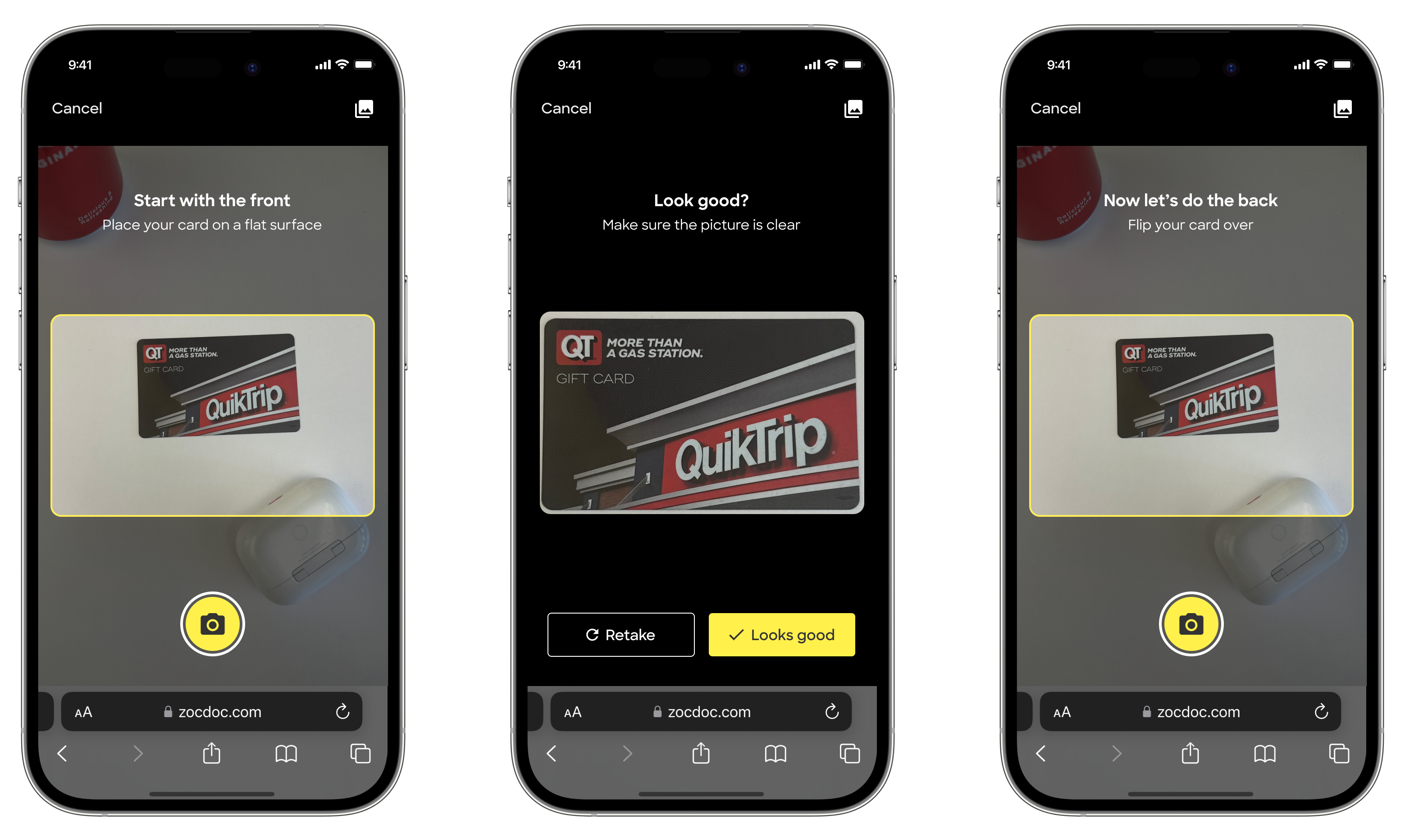
So we prioritized making it as easy as possible for patients to scan their health insurance cards. Rather than manually typing in policy numbers and group IDs, patients could take a photo and we'd extract the information. This reduced friction on the most important step and gave doctors the signal they cared about most.
07 Getting People to Even Visit the Page
The single biggest barrier wasn't the form itself. It was getting people to open it at all. You could have the best intake experience in the world, but if patients never clicked the link, none of it mattered.
The form wasn't the bottleneck. The outreach was.
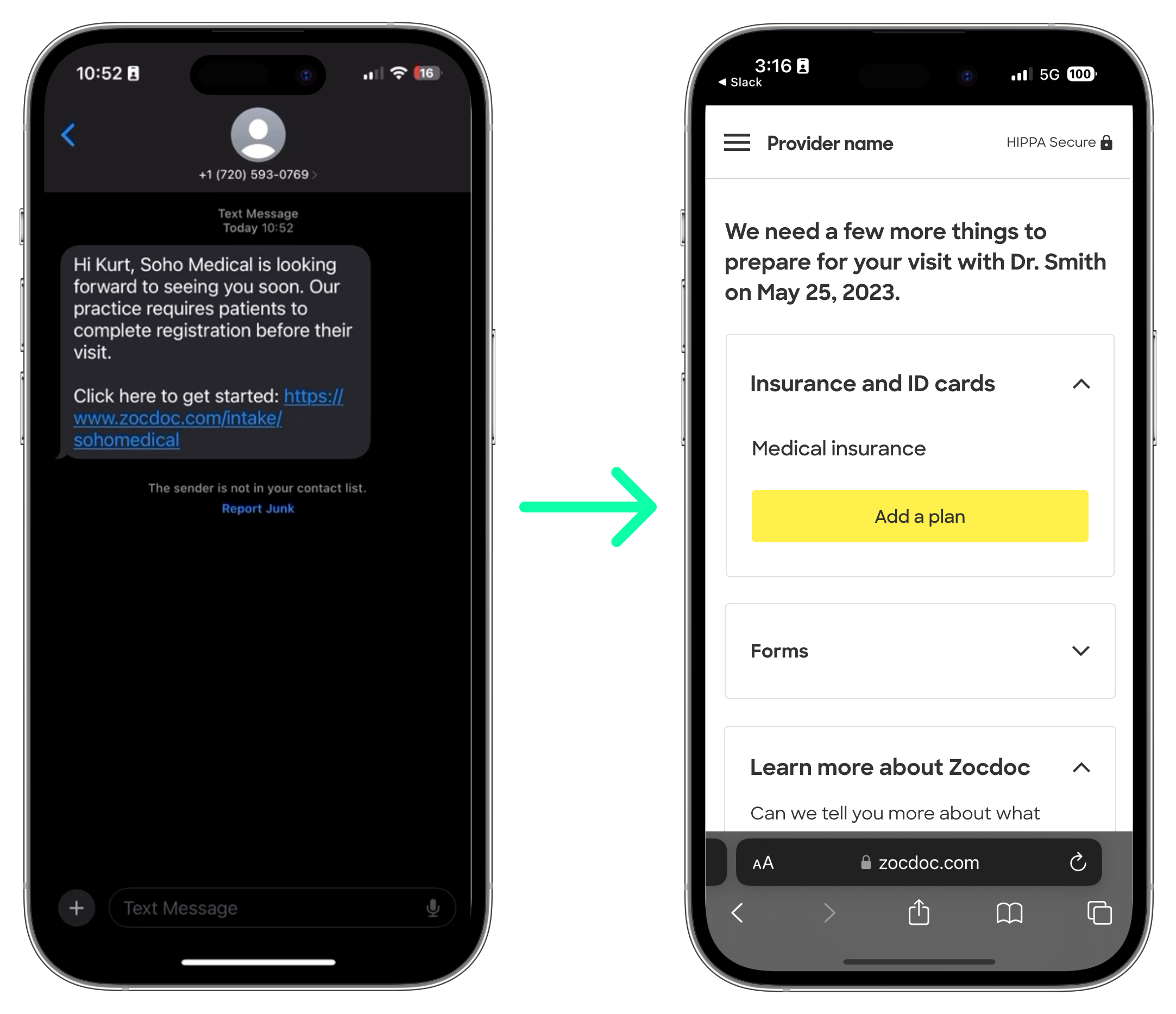
The existing emails were generic. "Complete your paperwork on Zocdoc." Patients ignored them. We redesigned the outreach completely.
Personalization changed everything. Instead of branding the message as coming from Zocdoc, we presented it as coming from the doctor's office. The SMS read: "Hi Kurt, Soho Medical is looking forward to seeing you soon. Our practice requires patients to complete registration before their visit." Including the provider's name made it feel real and urgent.
SMS was a bigger channel than email. Patients were much more likely to complete intake from a text message link. It met them where they already were, on their phones, and felt more like a personal reminder than marketing.
08 The Patient Experience
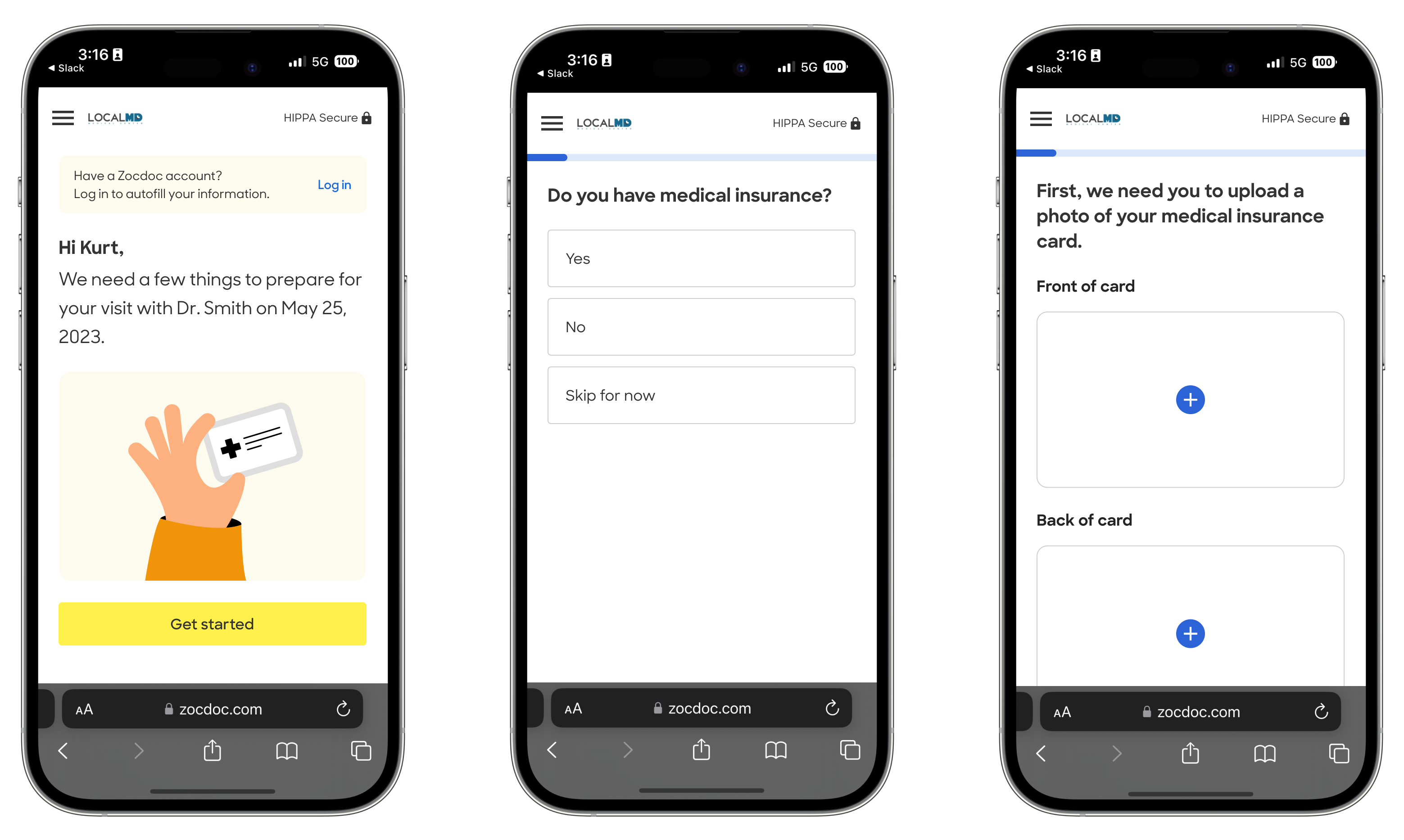
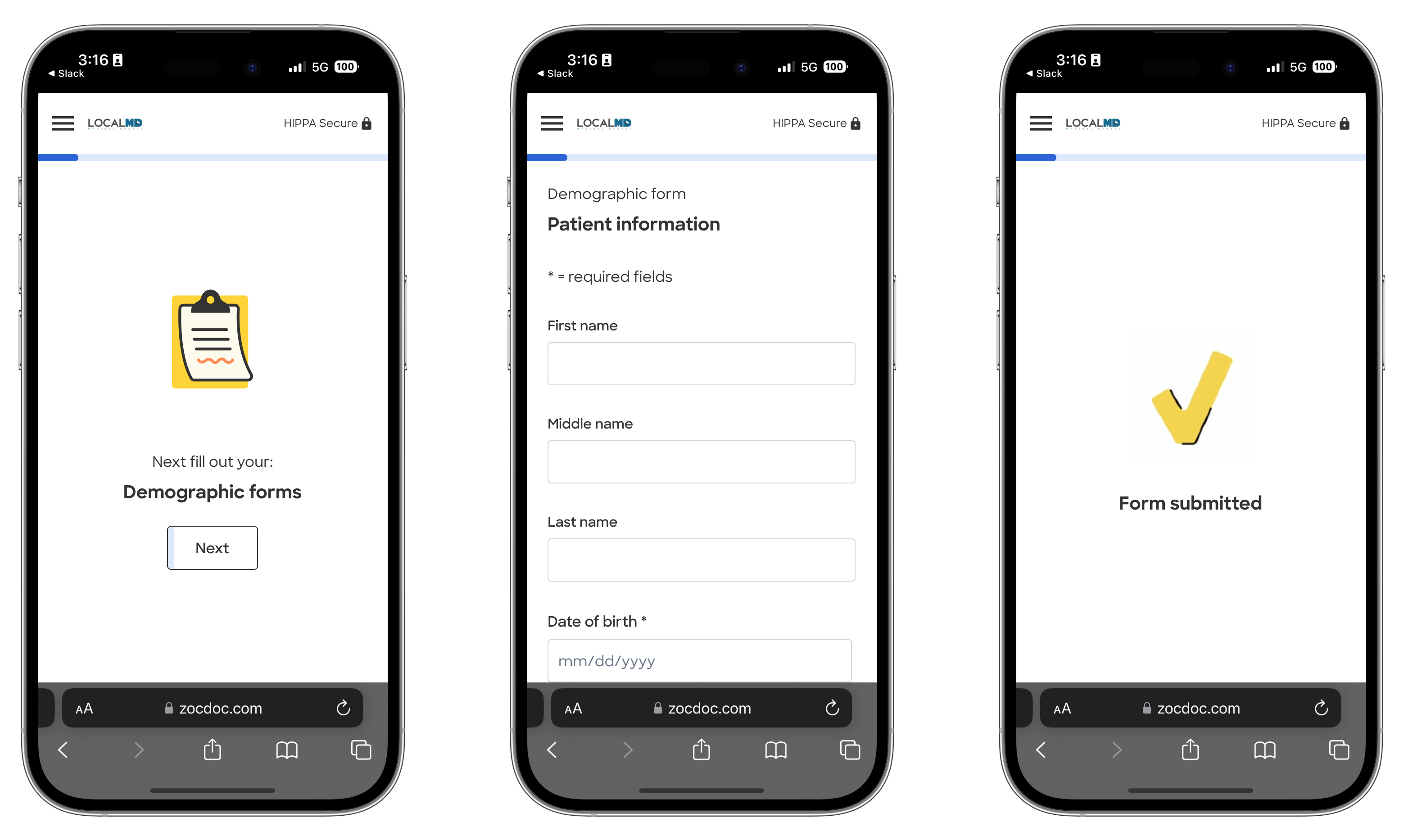
The flow had to feel effortless. Patients would receive a prompt to complete their paperwork after booking. They could fill it out on their phone, from anywhere.
- Mobile-first. Most patients filled out paperwork on their phones.
- Progressive disclosure. Only show relevant fields. Don't overwhelm.
- Reflect appointment details. Showing the doctor's name and appointment date built trust and made it feel personal.
- Show progress. Motivate patients to complete by showing how far they've come.
- Smart autofill. Information patients entered was saved to their account. The next time they booked with a different doctor, we could pre-fill everything we already knew about them.
Make filling out paperwork on Zocdoc faster than a clipboard in the waiting room. And faster every time after that.
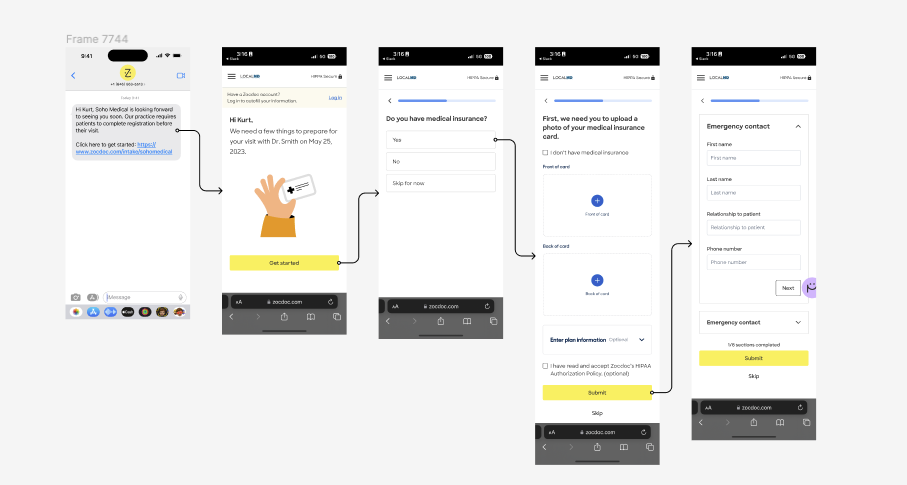
09 The Flow in Action
A recording of the intake experiment showing the guided flow from start to finish.
The intake experiment: bypassing the landing page and guiding patients directly through the flow.
10 Testing and Iterating
Experiment 1: Skip the Landing Page
The tactics were clear: take patients directly to the insurance task instead of a summary page, reflect appointment details for trustworthiness, and show progress to motivate completion.
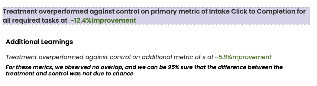
I designed an experience that bypassed the landing page entirely and pushed patients directly into the intake flow. We ran an A/B test with patient completion rate as the primary metric.
The initial experiment succeeded. We decided to keep iterating.
Experiment 2: The Guided Flow
We took it further by turning the entire intake task list into a guided, sequential flow. Instead of a checklist patients could pick through, it was a single linear path.
All metrics were statistically significant.
11 Usability Testing
Testing intake was tricky because of the sensitive nature of the information: insurance details, medical history, personal identifiers. We couldn't just hand real forms to strangers on a usability platform.
Remote testing (UserTesting.com): We had participants click through the flow, but replaced sensitive questions with more innocuous ones. This gave us solid signal on navigation, comprehension, and flow, without asking people to enter real health data.
Internal testing with real insurance cards: For the parts where accuracy really mattered, especially insurance card scanning, we tested internally with real cards. We needed to know the scanner actually worked across different card formats, lighting conditions, and phone cameras.
A/B testing on the landing page: We ran a controlled experiment on the landing page to measure bounce rate impact, with funnel tracking to see where patients dropped off at each step.
12 Results
We measured everything through controlled A/B tests, comparing the redesigned experience against the existing intake flow. Each experiment ran until we had statistically significant results. The redesign moved every key metric.
Headline Metrics
Task Completion Improvements
All results were statistically significant across both experiments. The redesign made intake more appealing to doctors by increasing the percentage of patients who showed up prepared, and more painless for patients by eliminating redundant questions and unnecessary navigation.
13 Other Things I Did at Zocdoc
Patient Communications Audit
Led an initiative to improve patient communications by auditing all pre-appointment touchpoints: emails, notifications, reminders. Identified gaps and inconsistencies, then redesigned the communication flow.
App Engagement Strategy
Created a strategy for the app engagement squad to drive return bookings with app features. Focused on re-engagement flows and feature discovery to increase booking frequency.
14 Key Takeaways
Every doctor is different.
Building a system flexible enough to handle any form while keeping the patient experience simple was the core design challenge.
Paperwork is a trust signal.
Completed intake told doctors this patient was real and prepared. It changed how providers perceived Zocdoc bookings.
The message matters as much as the product.
Presenting intake as coming from the doctor's office instead of Zocdoc changed everything about open and completion rates.
Speed compounds.
Autofill made the second appointment faster than the first, and the third faster than the second. That's a retention flywheel.