
My Role
Product Designer, Mobile Apps
I was on Zola's product design team, leading design for the mobile app. My work focused on contributing to the mobile app roadmap, identifying gaps in the app experience, and improving the overall design. The registry redesign was one of the core gaps I identified. I partnered with the larger design team and leaned heavily on learnings from the ecommerce website, which was far ahead of the mobile app in terms of maturity and development.
The Problem
Zola's mobile app had grown alongside the web app organically but had never had a dedicated designer. Using the mobile app was much slower than simply visiting the website due to navigation and UX issues.
The Product Detail Page (PDP) and Product Listing Page (PLP) were critical to enabling couples to quickly add items to their registry, and both needed significant work.
Audit & Research
I started by auditing the existing app and recording user testing sessions. The problems were immediately apparent. The app had deviated from standard iOS patterns in ways that were actively confusing people.
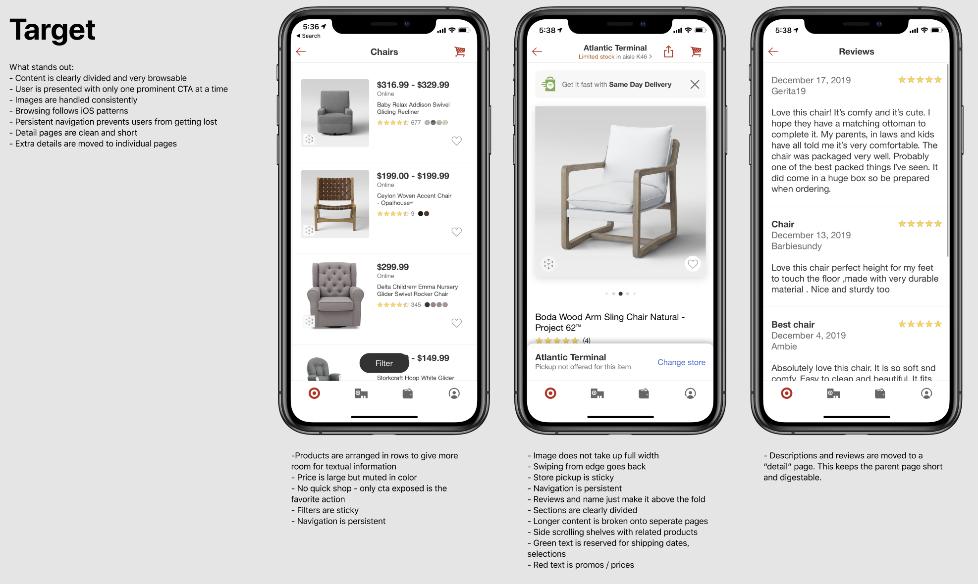
Competitive Analysis
A large part of this project was observing other ecommerce apps, both competitors like The Knot and Target, and non-competitors that were simply good consumer shopping experiences. The common thread was clear: these apps leaned into native iOS patterns, used standard navigation, and made it easy to browse through categories with a clear hierarchy. Zola's app was doing none of that.
Broken Navigation
The app wasn't using default iOS navigation controllers. Swiping from the left edge, which every iOS user expects to mean "go back," instead swiped between product categories. Button placement and page titles were in nonstandard locations. Users were constantly getting lost, ending up in places they didn't intend to go. Basic navigation felt unpredictable.
Inconsistency with the Website
The app and the ecommerce site had drifted apart. Product labels, pricing formats, and terminology didn't match. Previous research had shown that displaying our sale price in red and larger than the MSRP drove higher conversion on the web. The app wasn't following that pattern or several other proven conventions from the website.
SKU Selection Was Overwhelming
Many products had dozens of variants: not just colors, but different materials, bundle sizes, and configurations. The existing selection UI couldn't handle that complexity. Users struggled to find the variant they wanted, and there was no way to tell which items they'd already added to their registry.
The Grid Needed to Work Harder
The product listing grid was basic. No tags for items already added to a registry, no indicators for sales or new arrivals, no personalization. Couples browsing for registry items had no visual cues to help them scan efficiently or avoid duplicates.
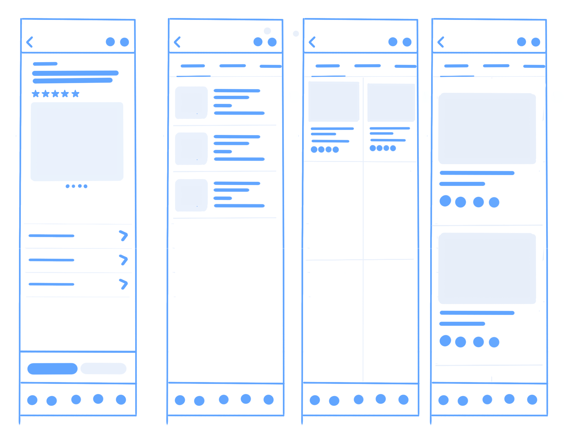
Validating the Direction
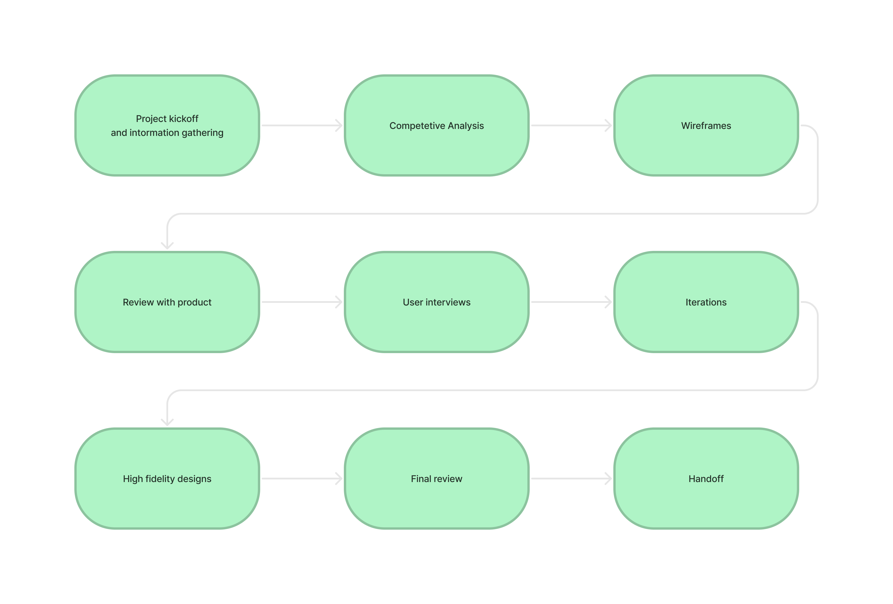
I created wireframes and mid-fidelity prototypes and used them for usability testing. The results confirmed we were on the right track. The navigation issues that had plagued the original app were largely resolved once we moved back to standard iOS patterns. Testing helped refine the details, particularly around navigation, and gave us confidence to move into high-fidelity design.
Explorations
Product Detail Page
For the PDP, I explored many layout improvements: moving the title to keep important info in view as users scrolled, reformatting the image gallery, and reworking the color and SKU selection UI to handle products with dozens of variants across colors, materials, and bundle sizes.
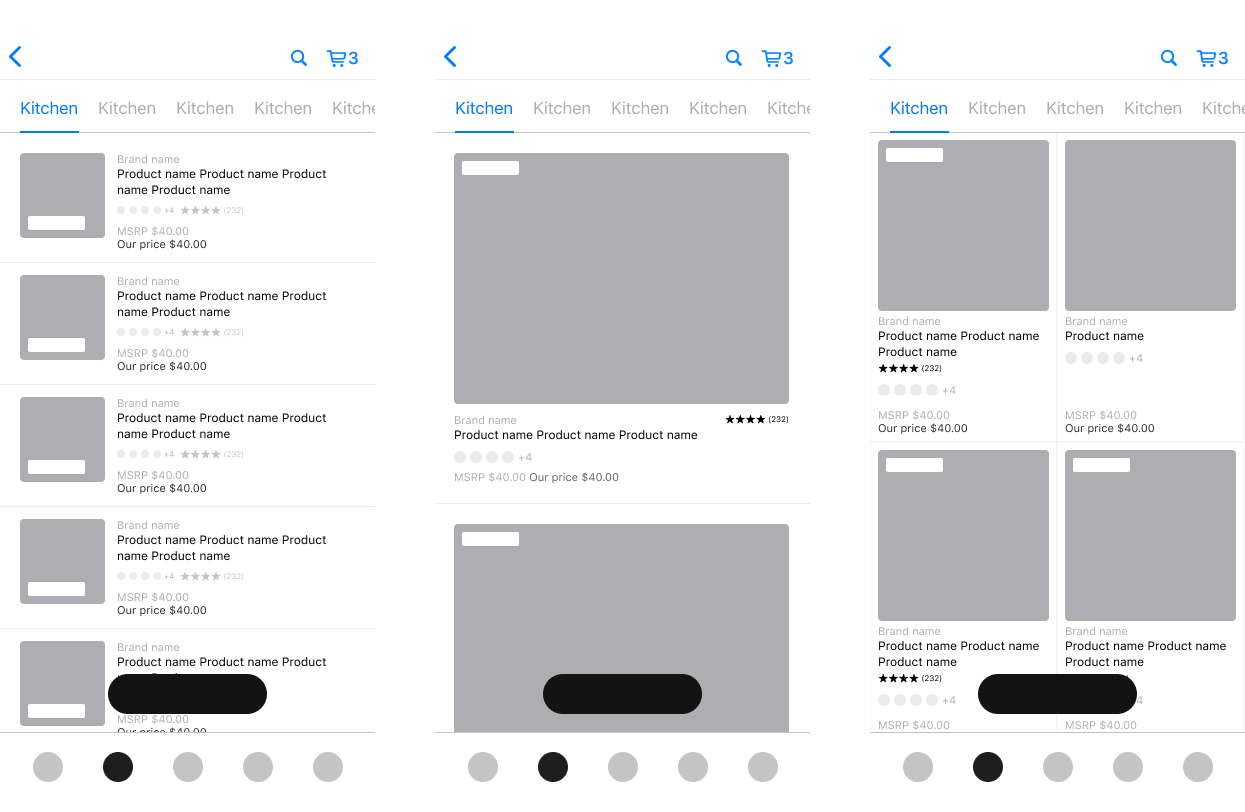
Product Listing Page
I experimented with different layout densities for the PLP, showing products in cards, rows, and grids. We ultimately chose a 2-up grid layout that fit more products on screen. I also explored adding star ratings, sale and new item tags, and indicators for items already added to a registry.
Final Designs
After testing several iterations of low-fidelity designs, I moved on to high-fidelity mockups using components from the Zola design system I had created. I also prototyped micro-interactions like adding gifts to the registry and switching colorways.
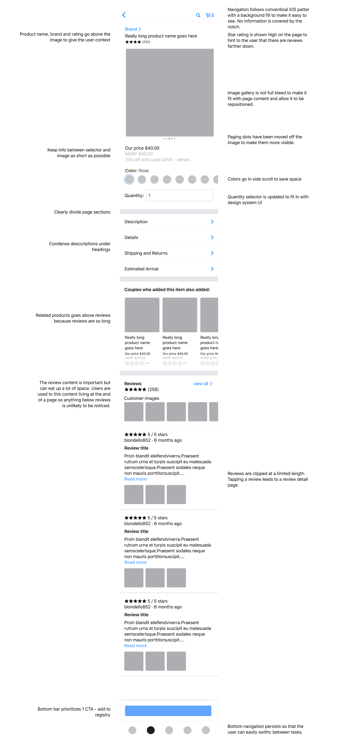
Improved Hierarchy
The redesigned PDP organizes content into a clear hierarchy: product information (name, brand, price, rating, images) at the top, followed by order options (color, quantity, size, shipping), then product details (description, dimensions, policies), and finally related content. Each level has a clear purpose and users can scan the page quickly without getting lost.
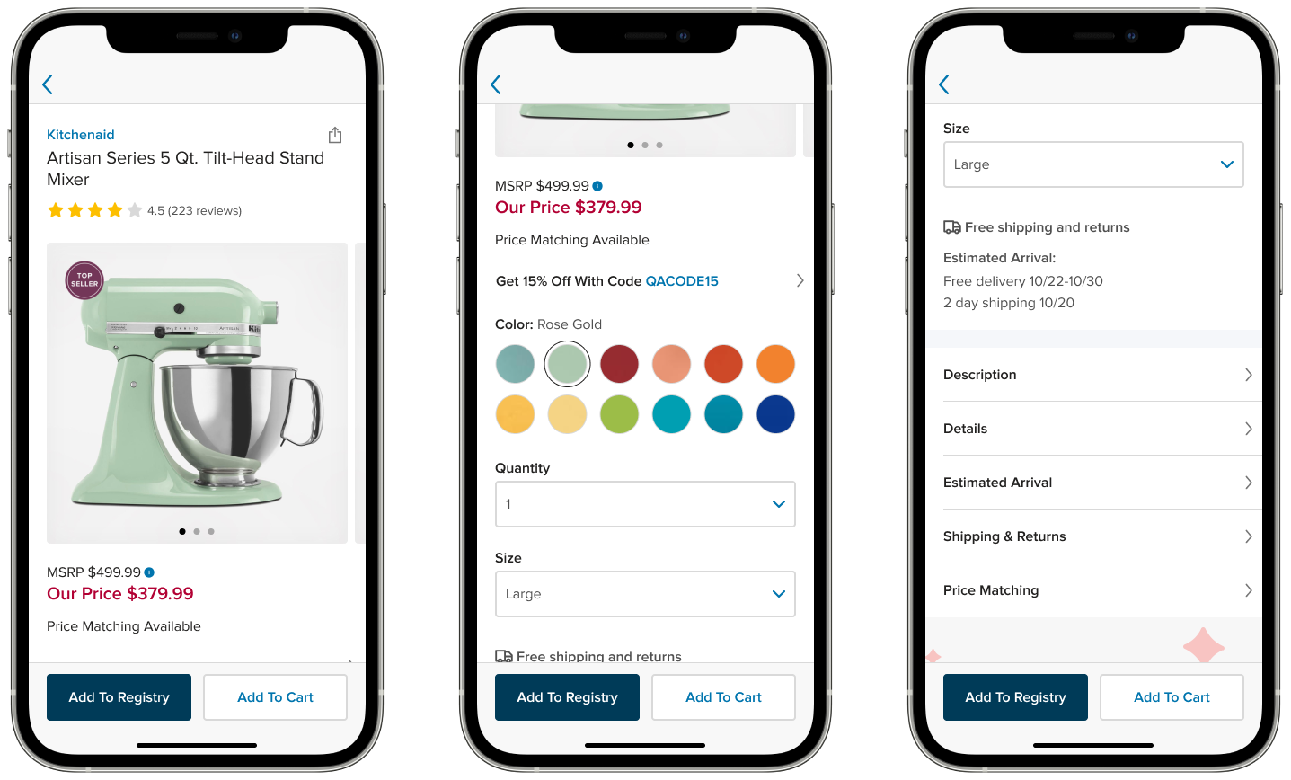
Gallery
The image gallery uses paging dots and a hint of the next image peaking off the edge to indicate there are more photos to see. The gallery also uses animations to give users context about what they're looking at and how they got there.
Product Details
Product details are condensed under expandable headings: offers, description, details, estimated arrival, shipping and returns, and price matching. Tapping any section opens a full detail page using a master-detail pattern, keeping the parent page short and scannable.
Add Interaction
Adding a gift to the registry takes only one tap. Registry management tasks like adding notes or editing a listing can happen later. I used haptics and a green toast message to provide sensory feedback and indicate success.
Standardized Navigation
We replaced the custom navigation with standard iOS patterns: a standard nav bar with a back button and support for the native back gesture (swiping from the left edge). This eliminated the confusion users had with the original app where swiping navigated between categories instead of going back.
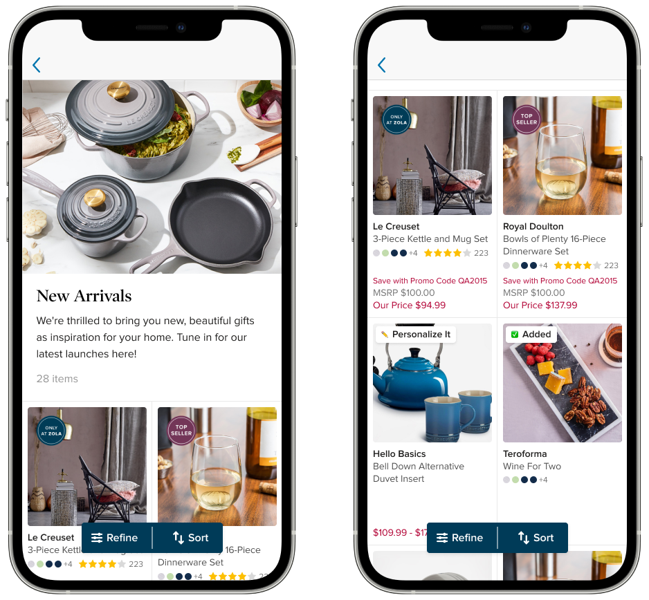
Refined Product Listing Pages
The tile design was refined to make product images larger by shrinking margins. Tiles use a fixed height to create a consistent grid, even for products with many color variants. Price is visually separated from product info, with "Our Price" displayed prominently in the brand's sale color. Color swatches, star ratings, and promotional tags like "Top Seller" are visible at a glance.
Making the Case for the App
The app accounted for only about 20% of registry adds at any given time. With a naturally smaller user base (the app was almost exclusively couples, not gift-buying guests) justifying continued investment wasn't automatic. As part of a growing team, I needed to align both the cofounders and the design team on the direction the app was going.
What the data did show was that app users were more engaged with Zola's other products like wedding websites, invitations, and planning tools. The app was a strong cross-sell opportunity and offered moments of delight that made it stickier than the web experience, even if it drove less registry traffic.
I built a presentation making the business case for investing in the app. We started with registry features specifically because they most directly affected revenue and gave us a chance to make significant UX improvements along the way, rather than trying to justify standalone UX work without a clear business hook.
Additional Work
App-Specific Roadmap
Downloading an app is extra friction. There needed to be a clear value proposition for keeping it on your phone beyond what the website already offered. A core part of my work at Zola was identifying areas where a mobile app could fill gaps the web experience couldn't, and building a roadmap around those opportunities.
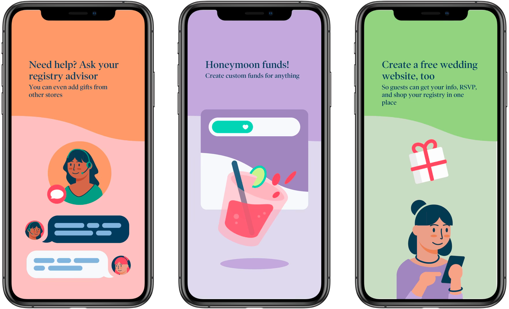
Onboarding Series
Designed an app-specific onboarding series that introduced users to the app's features. I created all of the illustration work and animation myself.
Design System
The app had accumulated one-off and legacy styles and had fallen behind the web product. Now that it was properly staffed, I standardized the mobile design system to embrace Zola's newer brand and web styles, bringing the app up to speed with the rest of the product.
Key Takeaways
Embrace platform conventions.
Don't deviate from standard navigation patterns and button placement unless there's a very strong reason. In this case, creative choices had been made for the sake of a unique experience, but they were hurting conversion by forcing users to learn new patterns for an app they'd only use once.
Consistency is a feature.
When something works on one platform, lean on that knowledge across other platforms. Proven patterns from the website gave us a head start on the app redesign.
Stakeholder management is design work.
Presenting changes to core business flows requires careful navigation.