The assignment
Customers kept trying to buy glasses or contacts and finding their prescription had expired. A new one meant a visit to an eye doctor, which at the height of the pandemic was hard to get and felt unsafe.
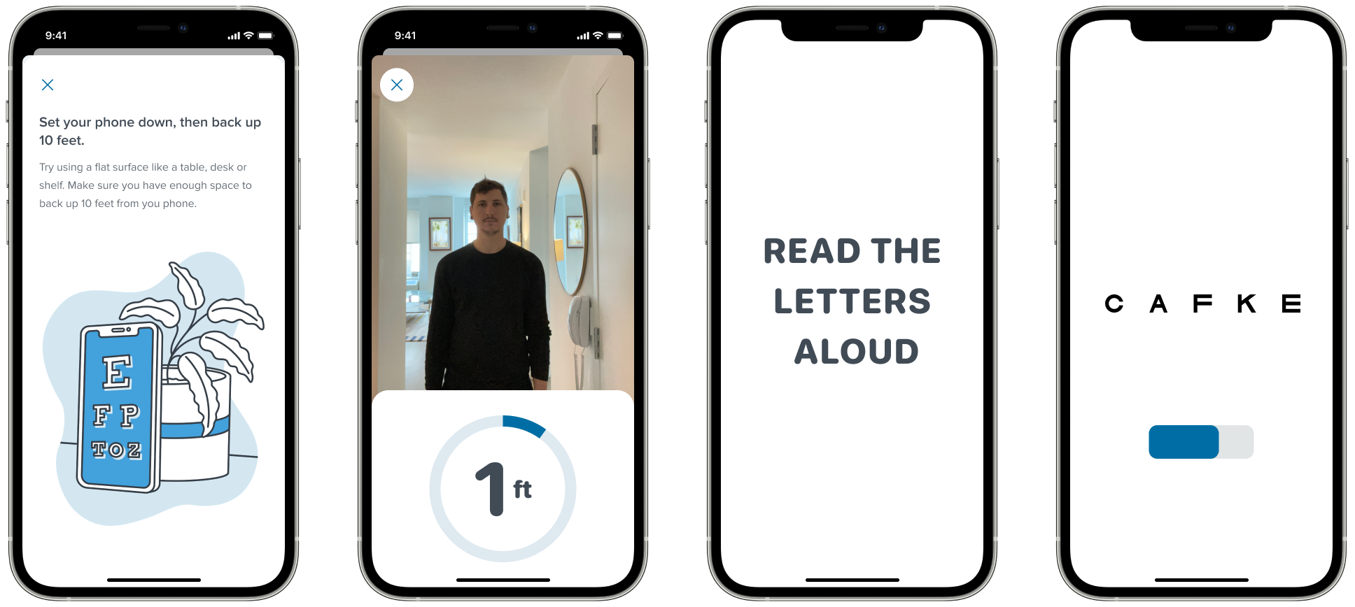
Warby Parker’s R&D engineers had rough prototypes that used the iPhone camera to work out how far a person was from the screen. An eye test is, more or less, reading a chart from 10 feet away. If the phone could confirm the distance, a doctor could trust the result.
The assignment was one sentence: “We think we can build a vision test.”
I was the first designer on it. My job was to find out whether that was true and turn it into a product.
Finding out who can use it
Only some prescriptions can be renewed this way, so the app starts with a survey. I prototyped it three ways and my research partner tested them with customers: a chat, a single form and a quiz with one question at a time. The quiz won by a wide margin. People could go back and fix an answer, which a chat made nearly impossible.
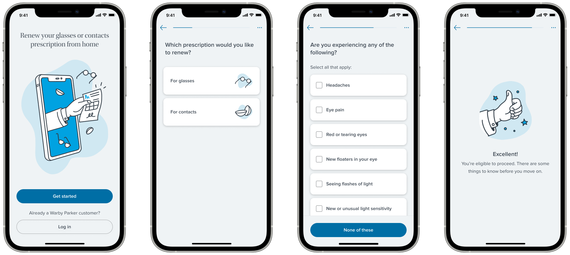
The hardest question was what kind of prescription someone has. Our first draft tried to work it out with easier questions, like whether they could read small print. People answered those wildly wrong. Listing the prescription types with a plain description of each was harder to read and got far more accurate answers.
The brand team drew illustrations for the moments between questions, and I animated them.

Ten feet from your phone
We were asking people to do something apps don’t normally ask: prop a phone against something, walk across the room and read a chart. From there you can’t tap a button, so the app has to guide you with sound and timing.
I built the whole test in ProtoPie, with the sounds, the spoken instructions and the timing, because none of that can be judged from still screens. We ran it with customers over video calls and had them measure 10 feet with a tape measure. Close to 80% passed, not far off a test in a doctor’s office.
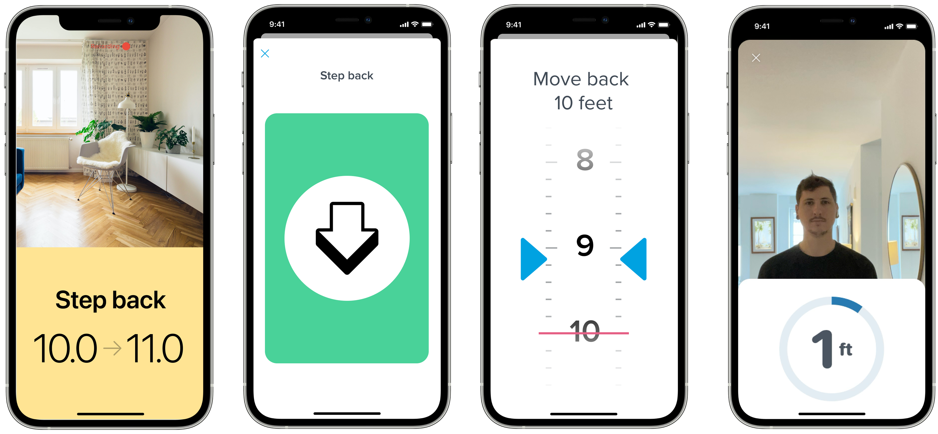
Our instinct was to open with instructions: find a well-lit room, make sure you have 10 feet of space. In testing, people spent minutes hunting for a better room before they had started. It worked better to let them start and give help only when something went wrong.
Three days in a room
When engineering built the real thing, the distance reading kept losing people. It was hard to fix over video calls, so we got everyone in a room for three days: two iOS engineers, two product managers, two researchers, an eye doctor, me and more than 20 people to test with.
One thing we found: after setting the phone down, people tapped a Continue button, and reaching for it often knocked the phone over. We removed the button. The test now starts when the phone senses it has stopped moving.
It didn’t work for everyone
Then we found the cause of the lost readings. We had assumed Apple’s face tracking worked for everyone. It often lost people with dark skin and people with beards.
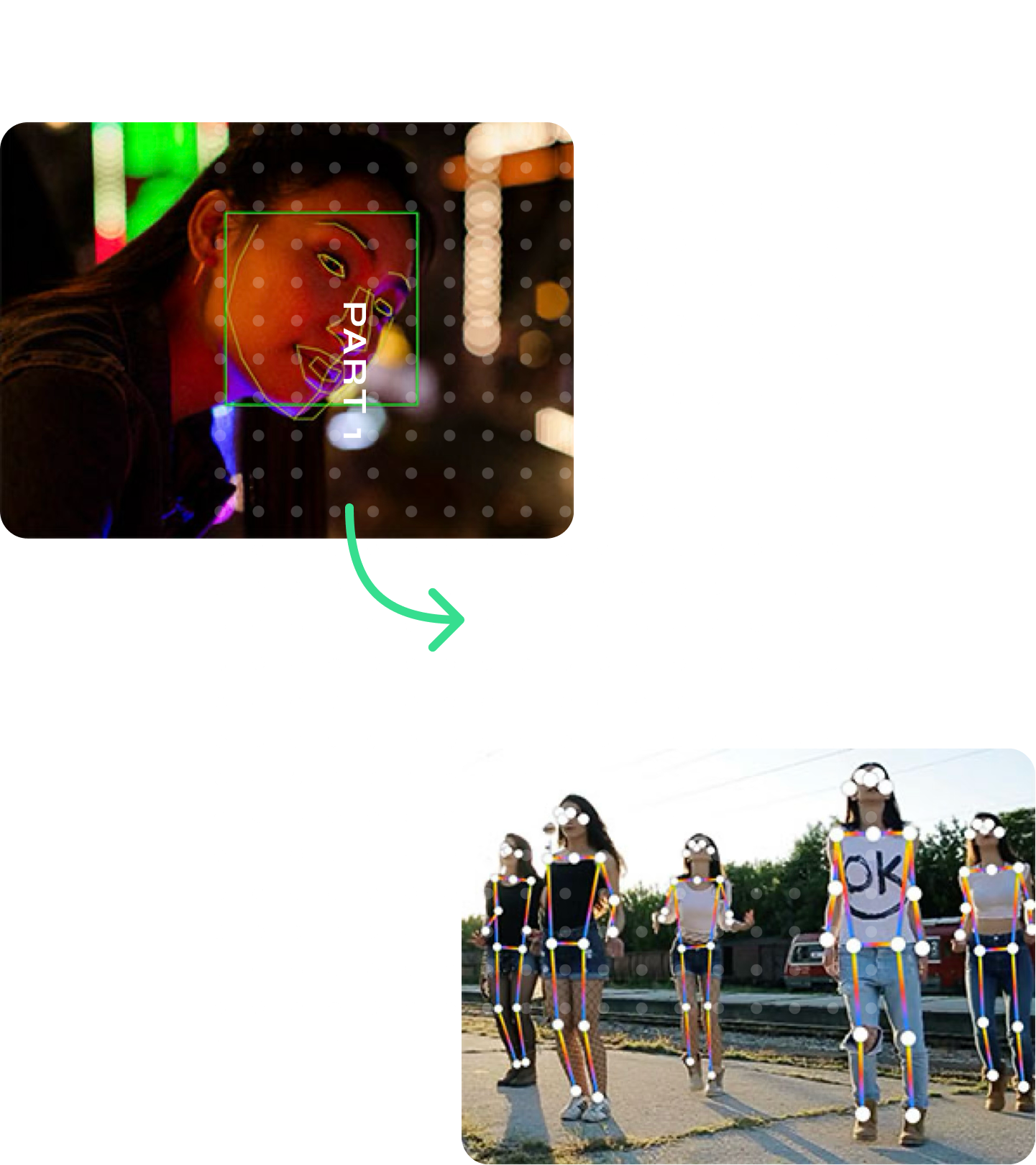
We told leadership it could sink the project. R&D switched from tracking the face to tracking the body, using the width of the shoulders to work out distance. It was a little less accurate and it worked on everyone. We tested the whole thing again, and the results were still accurate enough for the FDA.
Results
The app launched and doctors approved 83% of the tests people sent in. Warby Parker wrote thousands of prescriptions a month through it, and it became the base of the company’s vision services.
It won a Webby in 2022 and Apple featured it as App of the Day.